Code
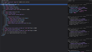
I selected this snippet of code as I was interested in the background graphic image. She reuses this image in different ways and I was interested to see how it was coded. The first thing I noticed though, was that she only uses this image on the desktop view. I saw that it was removed in the media queries on smaller screens which I did verify by viewing her site on my phone. On her inspiration page, I was interested in how the content scrolls over the image which does not completely show itself until after the main content. By looking further into her CSS code and looking it up in MDN, I learned about the CSS property "clip" which was in the snippet of code for this section. 
User Interface - UI
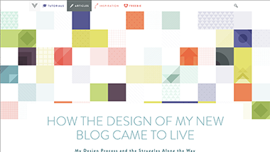
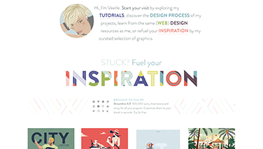
As I mentioned in the previous section, I noticed how she used her graphic image differently on her various pages. On her Inspiration page, the graphic is in the background and is partially hidden until the main content area has ended. The graphic appears again on her Home page, as an image in the Article Content section. Here, although it is not an active link, the image goes to grayscale when the cursor hovers over it. Her design elements show a lot of geometric influence, even her header h1 image shows the geometric styling as does her logo. This theme is consistently carried throughout her site which is a good design principle.
User Experience - UX
Even though she uses quite a large color palette, her generous use of white space does not make the amount of color overwhelming to the eye. What the site said to me was that this designer is a vibrant, fun-loving person and her personality spills over into her designs. I only looked at a few of her articles but she seems to be an engaging author. With her graphic images and included design sketches, her articles make for engaging and interesting reading.
Summary
Some may find her site a little too wild and in your face, but I found it to be lively and full of her personality. As this is a blog, I would think these are positive attributes to keep the blog followers engaged and returning. I felt her h1 image "Inspiration" could be her motto. I admit I felt excited and inspired to see what I could do with my header design for this review. I hope I captured some of the fun her site is imbued with. I plan on a more in-depth reading of her article on developing her blog (link to this article) at a later time as I think it will be fascinating to get a look into her thought process.