"All Who Wander Are Not Lost" (maybe).
A difficult part of this assignment was deciding on a website to review. It was like being on a road trip and the sat-nav isn't working. I wasn't sure where I was going or where I'd finally end up, but I sure saw a lot of interesting sites (pun intended) along the way.
Code
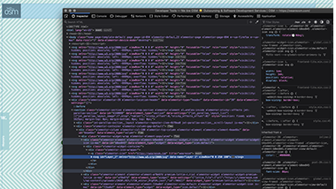
After I decided to review this website, I realized that this company used Elementor™ in Wordpress™ to build their site. Instead of coding the site from scratch, Elementor™ uses widgets to built elements. I was interested to see how these widgets would show up in Inspect. It appeared to me that the widgets are brought into the HTML using classes, with additional styling to the class defined in CSS to indivualize it to fit the developer's design. As this is an international company, it was also interesting to see in the CSS, that different fonts are styled based on the language the text will be seen in.
User Interface - UI
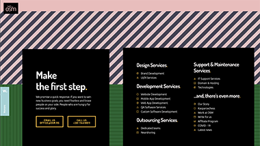
In general, I found that there was quite a lot going on in this site. However, I felt the home page gave a decent overview of the company, their purpose, services and how to contact them. The bottom of the home page lists additional information available on the site with links to those pages. If one was looking to see if this company could fulfil a need, I do think one could get a good feel for it from the home page.
User Experience - UX
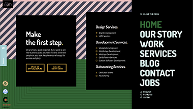
Big and Bold. That is the impression I was left with about this company. With the use of color, bold patterns and lots of motion I felt they were conveying the message that if you use their services you will not be overlooked. Even the images on the other pages are big. Every design element on the site seems to shout "Pick us! Pick us! We're your team!" If their intention is to grab your attention, I think they've succeeded.
Summary
Looking at the various sites, it was brought home to me that websites and how they are designed can serve many purposes. I came across sites promoting services, providing information, acting as clearing houses for further exploration, for fun and inspiration and even those acting as resumes.
Which to choose? What topic have we covered in class that I see that a particular site utilizes. Cards, fragment identifiers, automation, responsive forms or fun hamburger menus. I do find I look at sites a little more critically and try to see what I can pick out and say "Aha, I see what you did here!"