Extract UI Items
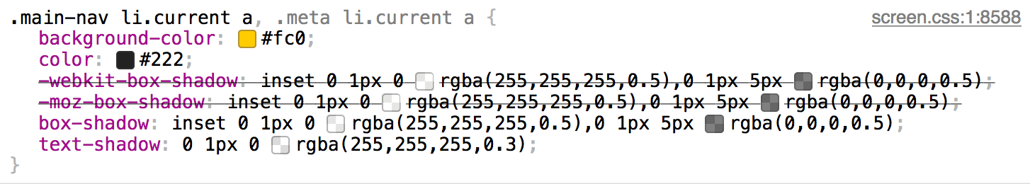
Navigation Current Page
User Interface Discussion
Discuss Why You Like The UI Item
Discuss The Techniques Used To Create The UI Item
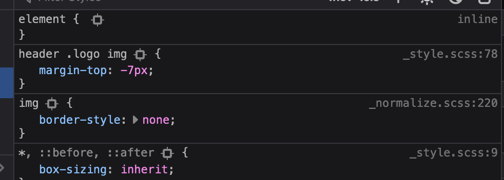
Home Page Logo
User Interface Discussion
I was drawn to the logo as it is fairly simple but seemed mysterious to me. The name brings up thoughts of " Dr.Jekyll and Mr. Hyde " and with the image of what appears to be a test tube of red liquid made me wonder what the company was about. Since that encouraged me to look further into the site, I felt that was a positive feature. And since I am a bit of a font junkie, I thought it was an interesting font.
The coding involved was fairly straightforward. Basically the logo was brought in as an image and put in position in the H1 element using the inline style attribute and adjusting the top margin.
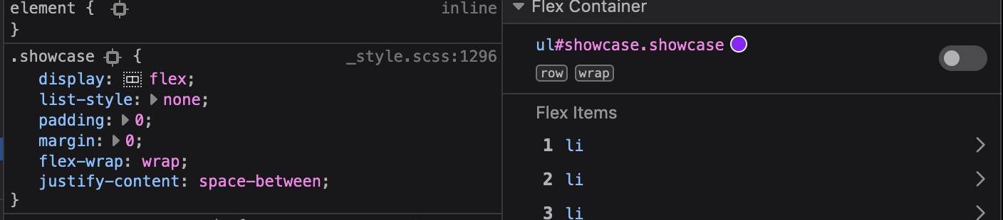
Showcase Page
User Interface Discussion
I had chosen to look further into the Showcase page to see how the page was built. It is a clean presentation of the many websites they want to highlight.
The gallery of various websites is displayed using a Flex Container with row wrap and space between.
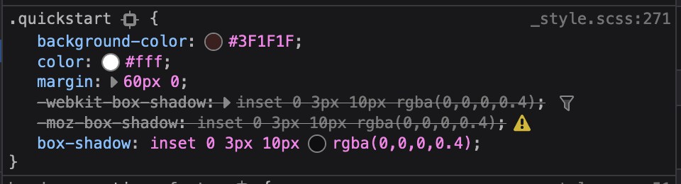
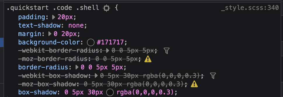
Quickstart Banner
User Interface Discussion
My eye was drawn to this element even though it is a dark color, and since the rest of the background is shades of gray, it still stood out. And when I looked more closely, the slight upper shadow gave it an interesting bit of dimension.
A class selector was used to define the background and font color and a box-shadow was applied.
Quickstart Instructions
User Interface Discussion
On this homepage, I feel the two elements the eye is most drawn to are the OctoCat and the Quick-start Instruction box as they utilize brighter colors. Between the two, I chose the box over OctoCat just to be different.
The box title was defined in CSS with margin, padding, border-radius, box-shadow, text-align, text-shadow, font and color. A different style class was assigned to the box content. Besides the various font colors, a different font-family was selected than is used on the remainder of the page which I feel also makes that element stand out more. There is also a media query assigned to the quickstart element. The media query defines that a different font-size is to be used when in a narrower viewport. This led me to play around a little with resizing my display and I could see that this website was built using the Mobile First design theory.